


Employee
•
5.3K Messages
•
55.5K Points
IMDb Name Page Redesign

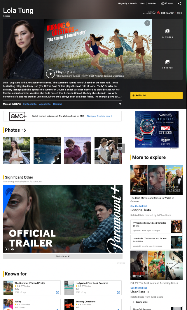
We are excited to announce the launch of IMDb’s redesigned Name pages! These pages are meant to make your IMDb experience easier and more enjoyable by providing better access to photos and videos, an upgraded view of an individual’s credits, and improved mobile navigation making it easier to view IMDb features on the go. These enhancements reflect changes suggested by IMDb customers, as well as our own in-depth research designed to enhance entertainment content, discovery, and navigation. More information is available in the FAQ on the help page.
We hope you enjoy these latest improvements, and thank you for continuing to make IMDb the world’s most trusted source for movie, TV, and entertainment content.
— The IMDb Team
English | Français | Deutsch | हिन्दी | Italiano | Português | Español
Rambonaattori
1 Message
•
66 Points
2 years ago
Sorry for my bad english, try to understand what i have to say. I had to register on the forum just to let you know that I'm not happy with the new style either. The only good thing about the new design is how well it works on mobile. In the old version you could easily see everything essential at a glance. Now you have to tap different menus to even see the episodes where someone has appeared. As already said, the impression is messy and confused.
Simplify these new pages for god's sake!
0
PR_Man
3 Messages
•
80 Points
2 years ago
Re: PR_Man's email, please see attached:
To illustrate the problem, consider the following IMDB link:
Note the link at the margin: 0;">To the far right it says: “2 Episodes”
If you click on the link “2 Episodes,” you get taken to the page below:
The screen shows the link to one episode “S4.E17 Passage on the Lady Anne” – But you can’t scroll down to see the link to the second episode
3
ds0
3 Messages
•
82 Points
2 years ago
A useful feature for determining the noteworthy films of a given actor, director, writer, etc. was to go to that list and then to sort by, say, the film's average review score, or, in my preferred method, to sort by the number of ratings the film had overall. When I browse someone's Credits section now, I can only filter by job type and their credits get sorted by date from latest to earliest.
Please consider bringing back more sorting in these and other lists on the site.
2
Thunderwing13
4 Messages
•
148 Points
2 years ago
Can anyone recommend a similar site to this one that has a better layout/structure/ease of use/user friendly/less complicated interface than this new design.
I know about Rotten Tomatoes, are there any others?
I never thought I'd ever be looking to leave IMDB but here we are.
2
nardog
58 Messages
•
1.6K Points
2 years ago
It looks like the option "Display credits separately for Movie and TV" in Content Settings is no longer respected. You can choose "Sort by" -> "Project type" on individual pages, but the preference does not get remembered. Is it just going to be this way? Any way to force the project type sorting?
1
eladzmr
2 Messages
•
70 Points
2 years ago
Hello,
I can't find where I sort and filter a director's work: by film type (Film, TV, Mini-Series, etc.) and sort it by Rating.
In the old IMDB, sorting buttons were placed in the right side, but now I can't find anywhere in the new user interface.
I used that sorting quite frequently and now it can't be found in the page.
Please assist
Thank you.
Elad.
1
james_johnston_4d5h8woi6a7ga
39 Messages
•
1.2K Points
2 years ago
Is there any way you could either save state of the page, or open things in new pages? If I bring up 'Charlie Brill' (nm0109318), click on 'Self', click on the Tattletales '45 episodes' link, go to page 3 of that list, click on an episode, then Alt+Left arrow (or click 'back') to go back to the previous page, that state is lost, and I need to then click on 'Self', click on '45 episodes, and click on page 3 to get back to where I was. If you included that state info in the URL, that would get the user back to where they were. The other option is to automatically open those detail pages in another window or tab so the user could close the tab or window to get back to where they were. Right now, I need to remember to right-click and select 'Open link in new tab' in order to not lose my place. Note: I use Microsoft Edge.
2
DetroitShadows
1 Message
•
60 Points
2 years ago
The actor page is poorly designed. Not being able to open up the actors full credits in a new page is very inconvenient and frustrating. Please give the option to view the old page design
1
artdepartment
2 Messages
•
70 Points
2 years ago
I hate this. The new design is clunky and over-simplified. Lifelong professional careers are now reduced to the few most "popular" credits. It's insulting. Credits in departments other than the most popular have been eliminated. Producers use IMDb as a tool to vet our credentials and experience, and I am concerned this new layout makes it harder if not impossible to view a comprehensive list of credits. Producers only look a page for a few seconds before deciding who to hire and what rate to offer, and this new layout cuts away most of the information. They are not going to hunt for removing filters or how to expand categories, etc. I'm sure someone that works for this company is going to recommend IMDb Pro for that, but believe it or not, not all producers or department heads have IMDb Pro. It's expensive and redundant. This new design is probably a move to sell more Pro memberships. Of course Amazon can do whatever they want, but jeez, this new layout is a giant bummer.
0
dbaxgirl51
1 Message
•
60 Points
2 years ago
Sorry to be blunt but the new layout sucks.
0
Atto
1 Message
•
60 Points
2 years ago
The new format is worse than the old. The thumbnails add nothing, but do detract from the information density on the page, requiring more scrolling to see an actor's entire credits list.
0
JPA
2 Messages
•
70 Points
2 years ago
Hmm, the new design is ugly and confusing. Never change a winning team - bad decision you made. I bet you spent a lot money for this! I think everyone wants to have back the old design/layout.
1
mark_moore
10 Messages
•
172 Points
2 years ago
The redesign is awful mainly because everything is bundled together. Please keep TV, movies, shorts, documentaries, etc separate. Perhaps an option to merge them would be welcome but it's now a joyless task looking up movies that someone has been in. What a useless idea to come up with.
10
BIGZ
22 Messages
•
554 Points
2 years ago
REVERT IT BACK This is the worst change IMDB has ever introduced, it's more complicated and confusing to navigate, you seriously need to listen to our views. Clearly no-one here even likes it. IMDB has gone downhill from this to slow contribution and stupid declined stuff not happy
1
mark_moore
10 Messages
•
172 Points
2 years ago
I checked my imdb page and all the info of the documentaries I have been in has disappeared. Is this a temporary glitch or will it be fixed? I assume this is happening to many pages and not just mine.
3